GridFlow Design Logo GridFlow Design Contact Us
Contact Us

Our Services

CSS Grid expertise tailored for Hong Kong’s most demanding web projects. We help agencies and enterprises build layouts that scale.

Designer working on responsive layout system on computer

What We Do

Grid Layout Strategy & Architecture

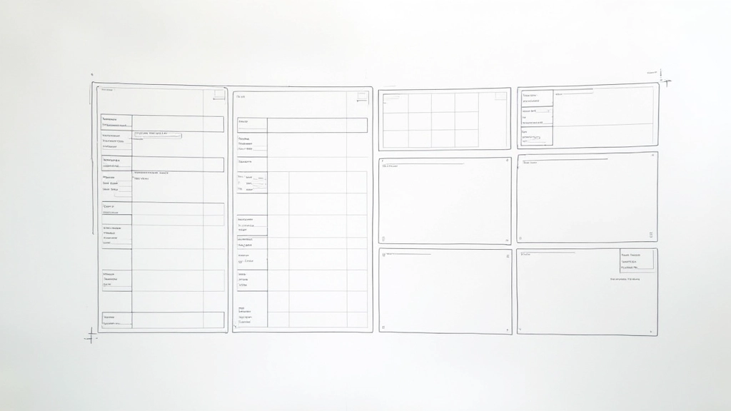
We design your entire layout system using CSS Grid and grid-template-areas. Starting with wireframes, we map out two-dimensional page structures that handle everything from hero sections to footer navigation. You’ll get documented breakpoints at 480px, 768px, and 1200px, plus a complete grid system guide your team can implement across 20+ pages consistently.

  • grid-template-areas planning
  • Responsive breakpoint architecture
  • Layout system documentation

Flexbox & Grid Component Systems

We build reusable component systems that combine Grid for page layouts with Flexbox for flexible component internals. This approach means your cards, navigation bars, and content blocks adapt beautifully to any screen size without duplicating code. Perfect for multi-page websites that need consistency across 50+ unique components.

  • Component-level Flexbox design
  • Grid and Flexbox integration patterns
  • Scalable design system documentation

Magazine & Card-Based Content Layouts

For content-heavy Hong Kong business sites, we create magazine-style and card-based layouts that showcase your services, case studies, or products beautifully. Using subgrid for nested alignment, we ensure typography and spacing stay consistent across varying content lengths. Works perfectly for portfolio sites, news platforms, and multi-category business websites.

  • Magazine-style grid designs
  • Subgrid for consistent alignment
  • Variable content-length handling

Dynamic Responsive Galleries

We implement auto-fit and auto-fill techniques that create galleries automatically adjusting from 1 column on mobile to 4+ columns on desktop—no media queries needed. Your image galleries, portfolio collections, and product showcases will reflow fluidly. Tested across 15+ device sizes to ensure perfect spacing and aspect ratio handling.

  • auto-fit and auto-fill implementation
  • Fluid responsive galleries
  • Cross-device aspect ratio optimization

Ready to Build Better Layouts?

Let’s talk about your project. Whether you’re redesigning an existing site or building from scratch, we’ll help you create layouts that work beautifully across every device.

Get In Touch