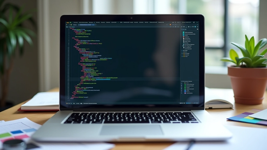
Grid-Template-Areas: Building Intuitive Two-Dimensional Layouts
Learn how grid-template-areas lets you visualize and code complex page structure with semantic naming.
Read MoreCreate visually rich layouts that guide readers through multiple stories. We’ll build a magazine-style design that actually performs well in Hong Kong markets.
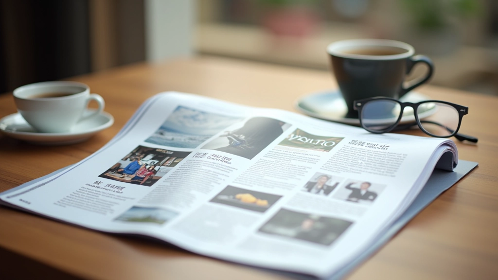
Magazine layouts aren’t just for print anymore. They’re the backbone of modern content-rich websites — especially in Hong Kong where visual storytelling matters. The difference between a good site and a great one often comes down to how you arrange your content blocks.
We’re talking about asymmetrical grids, featured cards that grab attention, and secondary content that doesn’t get lost. You’ll see these patterns on news sites, corporate portfolios, and e-commerce platforms. They’re not random. There’s real strategy behind how content flows and where the eye travels.
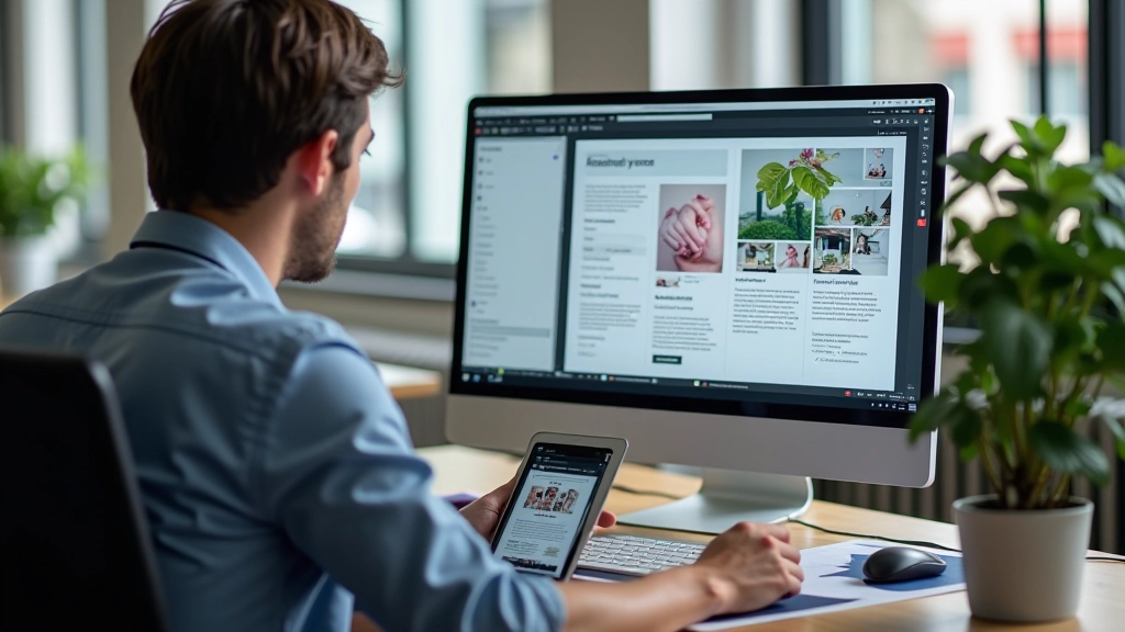
Every magazine has a cover story. Your website should too. The hero card — that dominant block at the top of your layout — isn’t decoration. It’s your chance to stop the scroll and say “read this first.”
On desktop, a hero card typically takes 50-70% of the viewport width and about 400-500px of height. You’re not trying to hide it. Mobile? Full width, stacked at the top. The card should contain an image, headline, and a brief description. Nothing more. The goal is clarity, not stuffing every detail in there.
In Hong Kong markets especially, brands use hero cards to showcase seasonal campaigns or featured products. The best ones we’ve seen combine strong imagery with minimal text — letting the visual do most of the talking.
Symmetry is safe. It’s also boring. Magazine designers figured this out decades ago. The real trick is asymmetry that doesn’t feel chaotic. You’re creating visual tension on purpose.
Think about a layout with one large featured card (say, 2 columns wide and 2 rows tall) paired with four smaller cards (1 column 1 row each). The eye knows where to start. The hierarchy is obvious without needing labels or arrows. This works because you’re breaking the monotony of equal-sized blocks while maintaining a clear grid structure underneath.
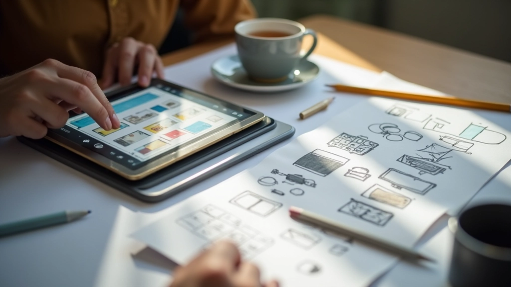
Using CSS Grid or flexbox with strategic sizing, you can achieve this in about 15-20 lines of CSS. The key is planning your grid first on paper — or in Figma — before you touch the code. Know your column count (12-column is standard), then decide which cards span how many columns.
Get the spacing wrong and your magazine layout looks cramped. Get it right and you’ve got breathing room that makes the design feel intentional.
We typically use gap: 2rem between cards on desktop, 1.5rem on tablet, and 1rem on mobile. The padding inside each card? About 1.5-2rem. These aren’t magic numbers — they come from testing. Cards feel too crowded with less, and they start looking disconnected with more.
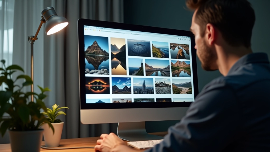
Image aspect ratios matter too. Featured cards often use 16:9 (landscape). Secondary cards might use 4:3 or even 1:1 (square) for thumbnails. You’re using shape and proportion to create visual rhythm. Varied aspect ratios keep the layout interesting without feeling random.
“Magazine layouts aren’t about fitting more content on the page. They’re about making content breathable and scannable.”
— Layout Design Principle
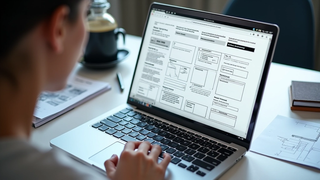
Here’s where it gets real. Your beautiful asymmetrical grid on desktop? It needs to stack gracefully on mobile. That doesn’t mean abandoning the design — it means adapting it smartly.
The featured card that spans 2 columns on desktop becomes full-width on mobile. The four secondary cards that were arranged 22 now stack into a single column. The grid structure changes, but the hierarchy remains. Your hero is still the hero. Secondary content is still secondary.
CSS media queries handle this automatically. At 768px breakpoint, you’re reducing column count from 12 to 6. At 480px, everything’s single-column. The cards themselves don’t change — just how many columns they span. This is why planning your grid structure first matters so much.

Magazine-style layouts aren’t a trend. They’re how humans prefer to consume information — with clear priority, visual breaks, and room to explore. Build them right and you’re not just following design patterns. You’re respecting how your readers actually navigate content.
Start with a clear grid. Define your column count. Plan your card sizes and asymmetry. Test on multiple devices. Use CSS Grid or flexbox (we prefer Grid for this use case). Set proper gaps and padding. Ensure responsive breakpoints. That’s it. You’ve got a magazine layout that works.
The best magazine layouts feel effortless. The reader doesn’t think about the grid. They just know where to look first, where to look next, and how to explore further. That’s the goal — make content navigation feel natural, not engineered.
This article provides educational information about modern web layout techniques and design principles. The methods, tools, and approaches discussed are based on current industry practices and CSS standards as of April 2026. Layout performance, browser compatibility, and accessibility requirements may vary depending on your specific project requirements, target audience, and technical infrastructure. Always test thoroughly across devices and browsers. Results may differ based on content type, image sizes, and individual implementation details. This content is intended for informational and educational purposes only.